The Power BI June 2026 Update in Plain Language
Cleaner models, simpler DAX, and a few quality-of-life fixes worth your time
Power BI ships an update almost every month, which can be hard to keep up with. I have spent years around data and reporting, but I came back to Power BI recently after a long time away, and I have been learning something new almost every week. So, I started writing these summaries as I go, one update at a time, in plain language, from the point of view of someone doing the work rather than someone who has it all memorized.
Many of the Power BI June 2026 updates points in the same direction. The most useful features of this month stem from the same theme: keeping your model lean. Write shared logic once. Put single-use math where it is actually used. Remove the small frictions that make report building slower than it needs to be. Here is what stood out to me and what I actually tried.
1. DAX user-defined functions are now generally available
If you write DAX, you know the copy-paste trap. You build a chunk of logic, then need the same thing in three other measures, so you paste it around. Months later someone edits one copy and forgets the rest, and your numbers start disagreeing with each other.
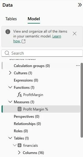
User-defined functions (UDFs) fix exactly this. You write the logic once as a named function with real inputs, then call it anywhere: measures, calculated columns, even visual calculations. One source of truth instead of four slightly different copies.
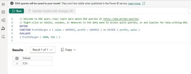
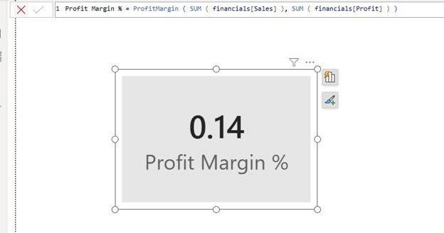
I tried a tiny one to start, a profit-margin function, and called it inside a measure on a sample model. Doing this took about ten minutes start to finish, and it just worked. The bigger payoff shows up on real models with a team behind them. When shared logic lives in one named function, consistency stops being something you document and hope people follow, and it becomes something the model actually enforces. Edit the function once, and every measure that calls it updates with it.
2. An editable results grid in DAX query view
This one is small, but sometimes the small details matter most.
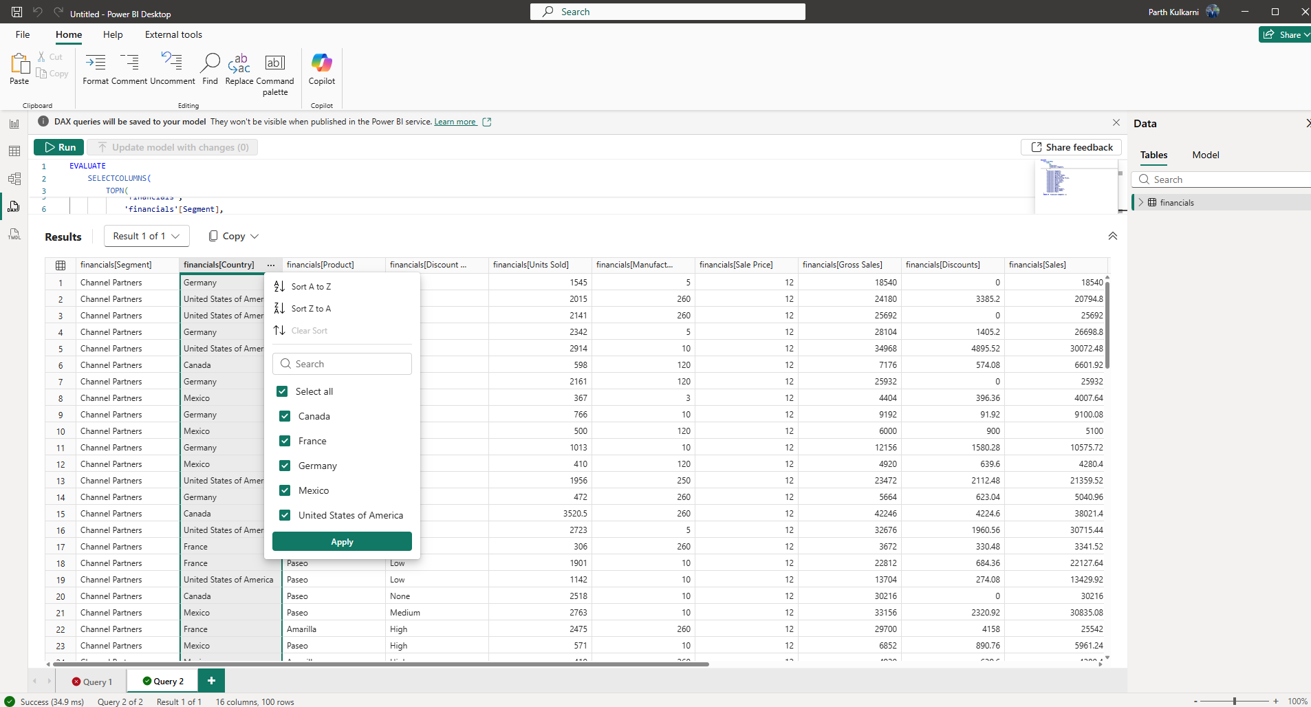
If you write DAX, you probably use the DAX query view to sanity-check a measure: write a query, run it, stare at the grid, and decide whether the number looks right. Until now, that results grid was read-only. Want the top values? Rewrite the query with an ORDER BY. Want to hide a category? Add a filter and run it again.
As of the June update, you can just click a column header in the results to sort it or use the filter on the header to narrow the rows, without rewriting the query. So now I run a query once and then poke at the output like a spreadsheet: sorting to find the biggest, filtering to isolate one thing, checking a total. The query stays clean while I explore the result. It is a few seconds saved each time, many times a day, which will create a lot of efficiency over time.
3. Visual calculations (and custom totals)
Visual calculations went generally available this month, and they change where you can do the math.
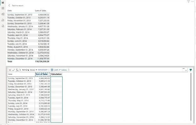
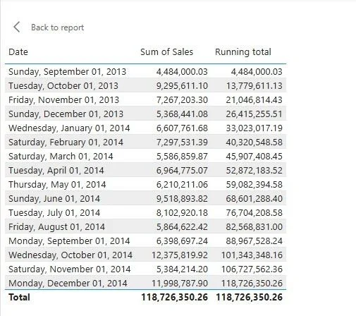
Normally, if you want a running total or a moving average in a chart, you write a DAX measure. That measure then lives in your model forever, even though only one visual uses it. Do that enough times and the model fills up with single-use measures nobody can track later.
Visual calculations let you write that logic directly on the visual instead: running total, moving average, percent of parent, and more. The calculation only sees the data already in the chart, so the syntax is much simpler than full DAX, and the model stays clean.
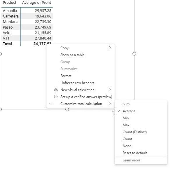
There is a companion feature worth knowing about too: custom totals. The total row of a table used to insist on summing, which is simply wrong when the column is an average. Now you can set a numeric column’s total to Average, or to None to hide it, without writing anything.
Together, these change how I decide what belongs in the model versus what belongs on the visual. The deeper I get into this, the more I want the model to hold only the things that are truly shared.
4. Two quality-of-life wins: sentence tooltips and slicer icon color
Neither of these is a headline feature, but they are the little fixes I end up using every day.
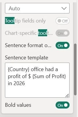
Sentence-style tooltip: Instead of building a separate tooltip page, you can now write your tooltip as a plain sentence, something like “Sales grew 12% vs last quarter,” and drop your field values right into the text. It shows up when someone hovers, so people get the context in words instead of a bare list of numbers. It is quick to set up, and it makes a report feel a lot more readable.
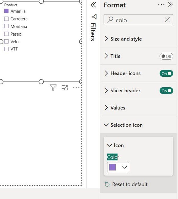
Slicer selection-icon color. You can finally pick the color of a slicer’s checkbox or radio button. Before this, that icon was a fixed color, which was a real pain on dark backgrounds where you could not tell what was selected. Now you can set it to something that stands out, so your filters stay clear no matter the theme.
The through-line
The theme running through June’s update is quiet but consistent: keep the model lean. UDFs give shared logic one home. Visual calculations and custom totals move single-use math out to the visual where it belongs. And the smaller reporting fixes just take friction out of the day.
None of this is a dramatic reinvention of Power BI, and it does not need to be. Month over month, these are the changes that make models easier to govern and reports easier to read, which, when you are the person maintaining them, is exactly what you want.
I write these up as I work through each release, as part of what I do at Eigen X. If you want the full, official rundown of everything in this release, Microsoft’s June 2026 feature summary has the complete list. And if you have already put any of these features to work on a real model, I would love to hear what you built.