The July 2026 Power BI Updates in Plain Language
Microsoft ships a Power BI update every month. Most months I pull out the handful of things that change how the work actually feels, try them on real data, and write up what helped. This is July.
I have been posting the highlights on LinkedIn over the past few weeks, one feature at a time. This is all of it in one place, in plain language, including the parts that did not make it into those posts.
The short version: July is a good month. One major update delivers real change in how quickly you can make a report look consistent, which is a small modeling addition that will improve documentation across a whole team. Additionally, there are a run of other updates for anyone distributing content to more than a handful of people. Here is what is worth your time.
Line charts can finally be colored by your data
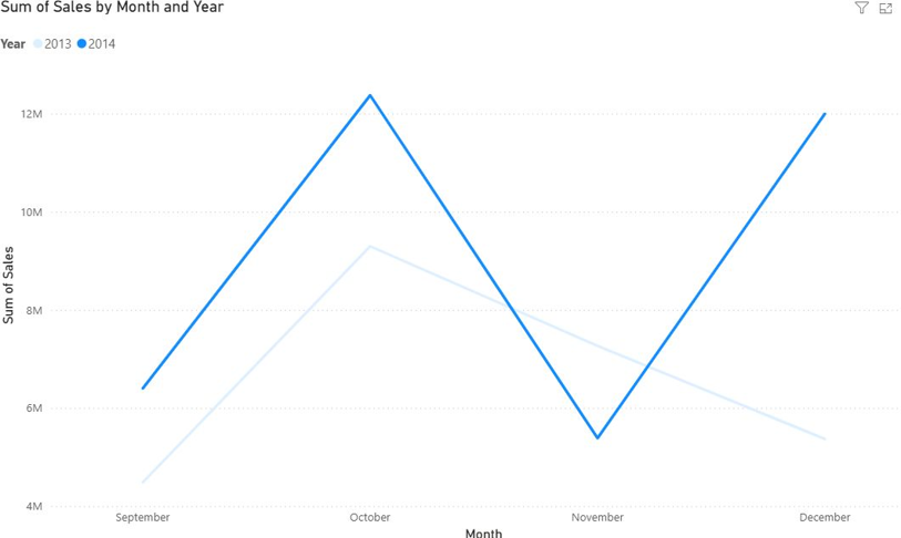
For years, coloring a line chart in Power BI meant taking the palette it handed you or building a stack of rules and hoping. As of July, conditional formatting works on any visual that has a legend, which includes bar, column, pie, donut, and line charts. It shipped generally available, not in preview, so it is safe to use in client work today.
In practice this means the color of a line can carry information instead of just telling lines apart. Put two years on the same chart and you can make the current year bold while last year fades into the background, so the comparison reads before you even glance at the legend.
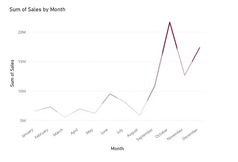
More interesting is coloring a line by a measure other than the one on the axis. In this chart, plot sales are measured along the y-axis of the chart and profit is signified by the color of the line itself.
Here, October peak runs dark as well as tall, which tells me that spike was my most profitable stretch and not just my biggest. Where the line runs pale, the sales were there but the profit was not. Two facts in one line.
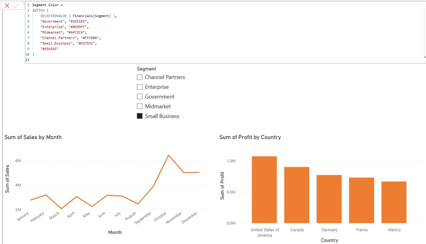
The change that will save the most time, though, is the least flashy. When several visuals share the same field in a legend, you can drive every category's color from a single DAX measure. Define once that Small Business is orange, and it will be orange on every chart in the report, including the monthly sales line and the profit-by-country bars together.
If you change your mind, then you only have to change one measure, not twenty visuals. If you have ever spent the evening before a review hunting down why one category is blue on page two and orange on page six, that is the fix.
Making a report look consistent got much faster
Anyone who builds reports regularly knows the routine: upload a new file, and you spend the first stretch turning off borders, setting padding, fixing fonts, and rebuilding the same palette you built last time.
July adds a Customize Current Theme panel that goes after exactly that. Click an empty part of the canvas, with nothing selected, and you can set the defaults for the entire report before touching a single visual. Apply a color palette. Turn borders, shadows, header icons, and tooltips on or off everywhere at once. Set border thickness, corner radius, and padding one time. You can also set page size, background, and wallpaper across every page together, then export the whole thing as a theme and reuse it on the next project or hand it to your organization.
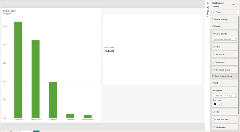
It is layered rather than locked, which is the part that makes it usable. The report-wide settings do the heavy lifting, anything you style on an individual page or visual still wins, and any setting resets cleanly back to the theme default.
For teams that do not hand-tune every report, it raises the baseline for how things look at no extra effort. One caveat: this one is still in preview, so you turn it on under Options first, and I would not hang a client deadline on it just yet.
Measures that document themselves
Here is an honest question: how many measures in your model have a description? For most models the answer rounds to zero.
It was never about not caring but adding one meant leaving the DAX you were writing, opening Model Explorer, finding the measure, and typing into a small box. Ten measures in, most people give up.
July updates remove the detour. You can now write a measure's description directly above the measure itself, in DAX query view, using triple-slash (///) comment lines. Apply the change and that text is saved into the model with the measure.
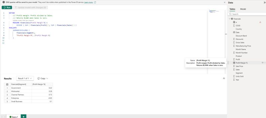
It is worth being precise about why this is different from a normal comment, because DAX has always had comments. A regular comment stays in the code, and nobody sees it unless they are reading the DAX. A triple-slash line above a measure definition is written into the measure's description, which is metadata: it shows in the tooltip when someone hovers the field in the Data pane, it appears in Model Explorer, it carries into the queries Power BI generates for you, and it reaches people connected to the model who will never open your DAX at all. Same idea as documentation comments in most programming languages. The comment describes the code; the description describes the measure.
It’s a small feature, but documentation that exists where the work already happens is the only kind that reliably gets done. Then, the next person to open your model (often a future version of you) gets a model they can read instead of one they have to reverse-engineer.
The small fixes that make the day smoother
Here are three minor changes that will not make anyone's highlight reel but take friction out of your workday:
Reordering report pages works properly now. Dragging a tab from the end of a long report toward the front used to stall, because the tab bar would not scroll while you dragged. It does now.
Title spacing makes sense. The controls moved to a consistent “space above” model, space above the subtitle, the divider, and the plot area, replacing the old “space below” settings. Existing reports look identical; the mental model is just no longer backwards.
Bookmarks work inside both author-published and personal org apps, so people can return to a saved view with its filters intact.
If you distribute content, org apps got a real upgrade
Org apps are now Microsoft's recommended way to package and hand out Power BI and Fabric content, and the July updates filled in several gaps at once.
Org apps with audiences reached general availability. You can define several audiences inside one app and give each group its own content and navigation, so executives, managers, and frontline teams each get an experience built for them without you maintaining three separate apps. Those audiences now work in the Power BI mobile apps too, so the tailored view follows people to their phones.
Alongside that, Storytelling for PowerPoint now works from org app content, so live report pages can go straight into a deck. And for anyone automating this at scale, there are new REST APIs covering create, read, update, delete, and list operations for org apps and audiences, and the same for paginated reports.
More of the modeling experience moved to the browser
Here are two additional changes worth knowing if you work on models. The Model Options dialog is now available in the Power BI Service, covering type detection, relationship detection, time intelligence, parallel loading, import locale, and DirectQuery settings, so you can configure model behavior without going back to Desktop. And TMDL View arrived on the web, giving you a code-first editor in the browser to script and apply changes across a model, which is genuinely useful for bulk or repetitive edits.
One more change to expect: the semantic model settings pane becomes the default when you open a model's settings in the Service, opening beside your work instead of taking over the page.
One thing to put in your calendar
From October, anyone still running a March 2026 or earlier build of Power BI Desktop loses the ability to save and share files to OneDrive and SharePoint. The fix is simply keeping Desktop current. If you look after a team, this is a good moment to check everyone is up to date, before it turns into a support ticket in the middle of a deadline.
What I would do this month
If you build reports, turn on conditional formatting for your line charts and try the theming panel on your next build. If you work on models, start writing measure descriptions inline now, while the habit is easy to form. And if you hand out content through org apps, the audiences and bookmarks work alone justify updating.
How we think about this at Eigen X
We track every Power BI and Fabric release so the teams we work with can spend their time building instead of reading changelogs. If you want a hand turning any of this into cleaner reports, better models, or a distribution setup that scales, get in through our bookings page. And if you want the monthly rundown as it happens, the series runs on LinkedIn.