The August 2026 Power BI Updates in Plain Language
Microsoft ships a Power BI update every month. Most months I pull out the handful of things that change how the work actually feels, try them on real data, and write up what helped. This is August.
I have been posting the highlights on LinkedIn one feature at a time. This is all of it in one place, in plain language, including the parts that did not make it into those posts.
August is a broad release rather than one headline. Report authors get a feature people have been faking with a workaround for years, the theming work came out of preview with a fix attached, the matrix picked up two changes that will get used constantly, and there is a solid run of modeling and connectivity work underneath. Here is what is worth your time.
Donut charts can finally use the hole in the middle
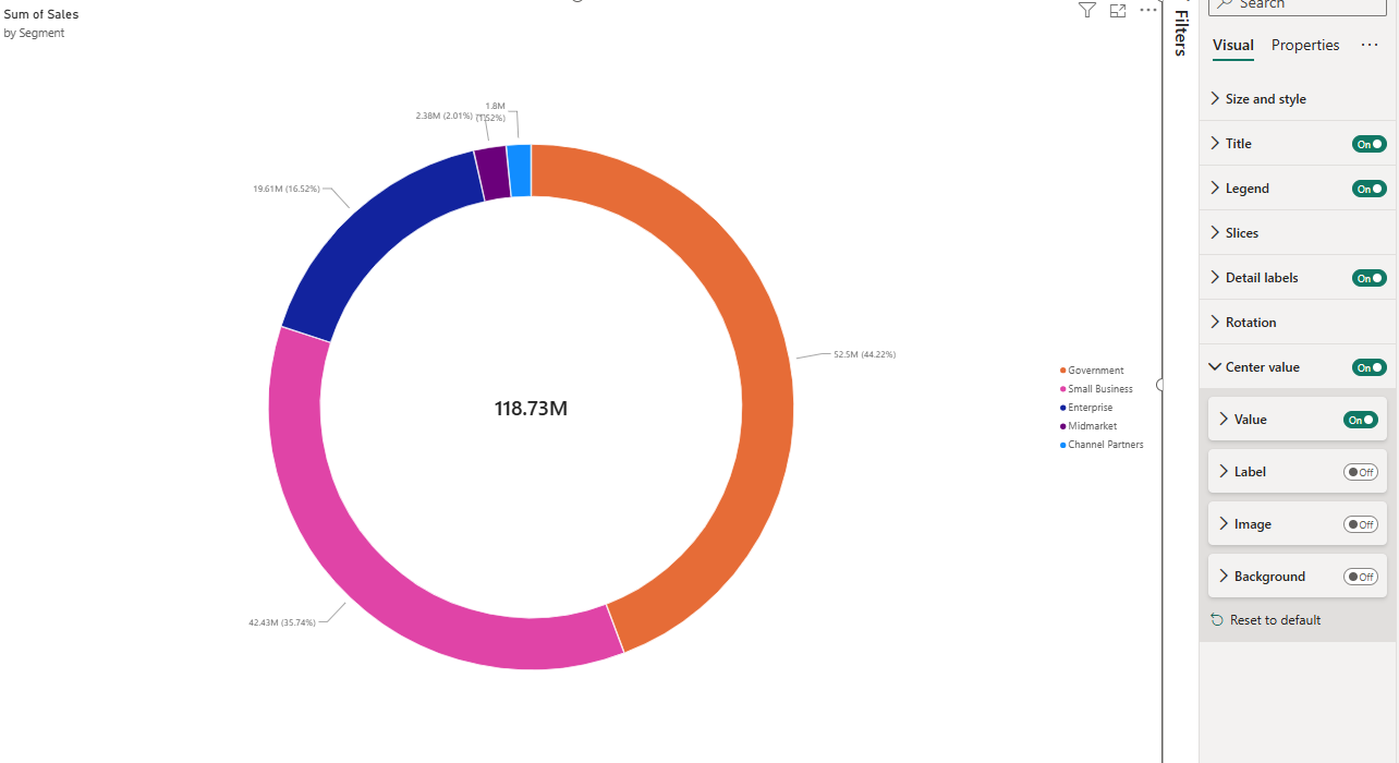
If you have ever needed a total in the middle of a donut chart, you know the workaround: put a card behind the visual, line it up by hand, and re-align it every time the visual resizes.
Make it stand out
Donut charts now have a built-in Center value setting, and no overlaid card is required. Turn it on and the value displays in the middle. You control the details in the formatting pane: value format, display units, and font. You can add an optional label above or below the value, place an image above or below it, or change the background fill or image of the center. If you want something other than the total in there, you can add a custom measure to the center value in the formatting pane.
What makes it better than the workaround is that it stays in sync with your data. Filtering, cross-highlighting, drill-down, and selecting a slice all update it automatically. And because it lives inside the visual, it stays aligned across resizing, mobile, and dashboards, and it works with screen readers.
Report theming is out of preview, and the fonts got fixed
The theme customization work that was in preview through the summer is now generally available. New reports created in Power BI Desktop and in the Power BI service start with the Fluent 2 base theme, which gives you a consistent look without formatting each visual.
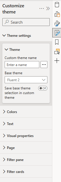
The Theme pane handles the rest from one place: set the base theme, adjust colors to your brand or pick one of the available color palettes, change text styles, set specific visual properties, page settings, and the filter pane look and feel across your entire report, and import or export a custom theme, in both Desktop and web.
The change that will matter most day to day is easy to overlook. Microsoft removed all font overrides from the base theme, and in their words the Text section in the Theme pane now works as intended. Change a font in one place and it updates titles, callouts, labels, and general text across every visual in your report, including new visuals added later. The release notes do not spell out what the earlier behavior was, only that this is now working, so if you tried theme-level fonts during preview and they did not hold across your report, that is the fix. It is worth another look.
Two matrix changes report builders will use constantly
Column headers can now expand and collapse, just as row headers already could. When your matrix has more than one field in the Columns field well, plus and minus icons appear on the column headers so you can combine groups or reveal more detail directly in the visual. You can also customize the color and size of those icons under Column headers.
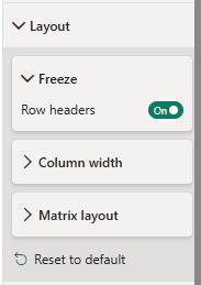
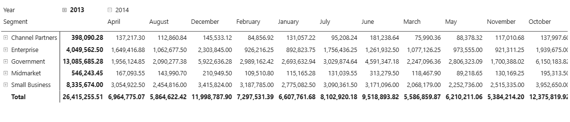
Separately, report authors can now set the default freeze state for matrix row headers directly in the format pane. Turn the Row headers toggle on or off under Layout and then Freeze to control whether row headers stay visible or scroll away when consumers scroll horizontally. That default is saved with the report and applies to everyone who views it. The right-click Freeze and Unfreeze options are still available and, as before, remain transient, so consumers can flip the state temporarily without changing the author's default.
Microsoft points out that the freeze setting is especially useful for mobile layouts. On phones, portrait orientation limits horizontal space, so you might unfreeze the row headers on your mobile layout to give data values more room while keeping them frozen on the desktop layout, which typically uses landscape.
More control over how semantic models refresh
Refreshing a semantic model in the service used to be all or nothing: selecting Refresh always performed a schema sync followed by a data refresh. That works in most scenarios, but not all. In a Direct Lake semantic model, a Lakehouse table might have changed by gaining new columns, while you only want to load the latest data without bringing those schema changes into the model.
The Refresh button now includes three options: refresh schema and data, sync schema only, or refresh data only. Refresh operations can also be performed at the table level, so you can refresh a specific table instead of the entire semantic model and choose whether to refresh its schema, its data, or both.
Direct Lake gets calculated columns and mixed-mode tables
Two Direct Lake features arrived in preview. The first lets you define calculated columns directly in your semantic model using DAX, in web modeling and in Power BI Desktop, without changing the table storage mode or modifying data upstream. The columns do not materialize and are evaluated at query time, security context is respected for both row-level and object-level security, and user-context-aware DAX functions are supported. Because they do not materialize, they cannot be used in relationships. No preview switch is required.
The interesting use is localization. A calculated column built with USERCULTURE displays month names in the language of the person viewing the report, so one model serves a German and an American audience without duplicating anything. Expressions that do not reference user-aware functions or secured columns behave like any other DAX calculated column.
The second lets you convert individual Direct Lake tables to Import storage mode directly in Power BI web modeling, giving you a path to a Direct Lake composite model. Select one or more tables and change the Storage mode in the Properties pane, and the flow guides you through configuring a connection and refreshing the table into Import mode. Two things to know before you try it: Microsoft's own warning dialog states that setting storage mode to Import is irreversible and cannot be switched back to Direct Lake, and the feature is rolling out over the next few weeks rather than being available everywhere immediately.
Images from OneLake, and better maps
You can now use links to image files stored in OneLake as an image source anywhere Power BI accepts an image URL. That covers the image visual, table and matrix cells, the card visual, button and list slicers, and custom icons in the Icons cell element when you use the Field value format style. The useful part is that OneLake file links work even though they require authentication, because Power BI signs in on your behalf when the report loads, so you do not have to make images anonymously accessible to use them. Reference layer maps and shape map files can be linked the same way.
Azure Maps improved in two ways. Shape matching in reference layers is significantly faster, so joining your data to custom territories or regions in a GeoJSON file renders quicker and responds more smoothly to filtering, cross-highlighting, and zoom. No configuration change is required and existing reports benefit automatically. Separately, the Azure Map visual has a 30,000 data point rendering limit, and points beyond it previously did not display even when you filtered to a smaller area. Now the visual reloads to include the newly relevant points, and it auto-zooms to fit the filtered area rather than staying at the original viewport.
Smaller fixes worth knowing
Charts can fill their plot area. Column, bar, clustered, line, ribbon, and waterfall charts have an Outer padding setting under Layout. Set it to 0%, and Space between categories to 0% as well, to fully fill the plot area. On line charts with categories, reducing outer padding also shows more data before a scrollbar appears.
Slicers picked up real formatting control: a top-level Dropdown section covering border color, rounded corners, and the open icon color and transparency, plus an Accent bar with color, position, transparency, and width. Hierarchy slicers get colored expand and collapse icons and a choice of which icon to use. The color settings support conditional formatting.
The date picker slicer went generally available, combining relative selections that roll forward over time with a calendar and slider. New in this release is a Single date setting that restricts the slicer to one date at a time, and you can clear selections from a header icon.
Comments now work on reports in org apps, including @mentions, and comments capture the current report context so colleagues can see what you were looking at.
Copilot Summary and Copilot Narrative can now read visuals that are hidden by default and revealed by a display-only report bookmark. Visuals are read in place with no change to the bookmark state, and row-level and object-level security stay enforced.
On mobile, Export data is now available for iOS and Android, and the exported file reflects your current filters, slicers, drill state, permissions, and row-level security. A Rotate view button in the report footer is also coming, though Microsoft describes that one as rolling out soon rather than available today.
Embedding Power BI in SharePoint Online is easier: you can browse and select the workspace rather than pasting a full URL, and a toggle lets you embed a single visual.
For anyone working with Power BI Projects, you can now edit PBIP files outside Desktop and reload the changes instantly without restarting, and there is a built-in entry point that opens your project in Visual Studio Code.
In Power Query, theming improvements address color contrast and readability across light and dark themes, and connector icons with transparent backgrounds now get a white background in dark mode so they stay legible.
Two dates to put in your calendar
From October, anyone still running a March 2026 or earlier build of Power BI Desktop will no longer be able to save and share Power BI files to OneDrive and SharePoint. The fix is simply keeping Desktop updated. If you look after a team, this is a good moment to check everyone is current before it turns into a support ticket in the middle of a deadline.
Separately, in early September the permissions needed for Fabric Apps change. Consumers will need only Read permission on the underlying semantic model, along with access to the Fabric app, rather than the broader Build permission required today. App authors will still need Build permissions. If you have been holding off on sharing an app because Build felt like too much access to hand out, that objection is about to go away.
What I would do this month
If you build reports, go clean up any card-behind-donut workarounds and give the Theme pane another try now that the font settings work properly. If your reports lean on matrices, the column expand and collapse alone will save you building navigation you no longer need. And if you manage models in the service, the new refresh options are worth understanding before the next time a schema change catches you out.
How we think about this at Eigen X
We track every Power BI and Fabric release so the teams we work with can spend their time building instead of reading changelogs. If you want a hand turning any of this into cleaner reports, better models, or a distribution setup that scales, get in touch through eigenx.com. And if you want the monthly rundown as it happens, the series runs on LinkedIn.